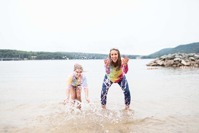
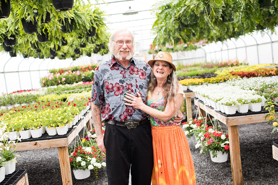
I love color. My favorite is yellow (my least favorite is navy, blah) but I really just want the rainbow, or tie dye. So when answering “what to wear for photo time” maybe my response is heavily influenced by my love of color. In the end though, I say the more color, the better. I read something on Instagram recently…
“Color stirs emotion. It invites curiosity. It asks us to notice. It nudges us toward aliveness in ways we can’t always put into words.”
“There was a time when color wasn’t curated. Color wasn’t a bold choice. It just existed everywhere. It was the default.”
The source, The Pigeon Letters, goes on to suggest that color began to disappear by design because in mass production it’s cheaper to produce, easier to make and harder for people to complain about if it’s neutral. Also, “beige offends no one.” HA! This makes me chuckle a little.
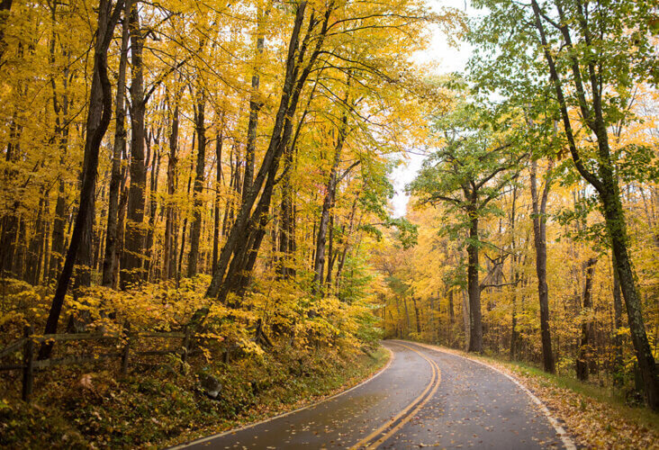
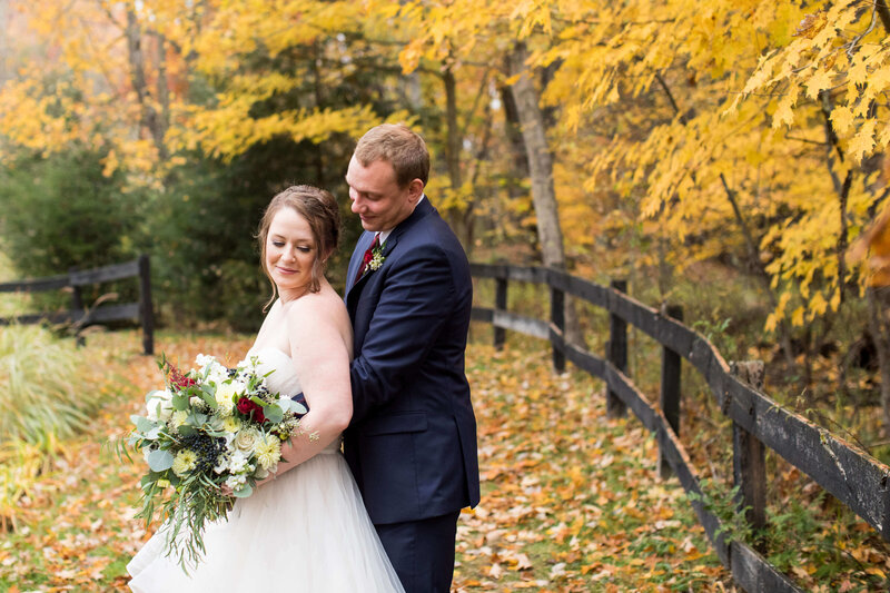
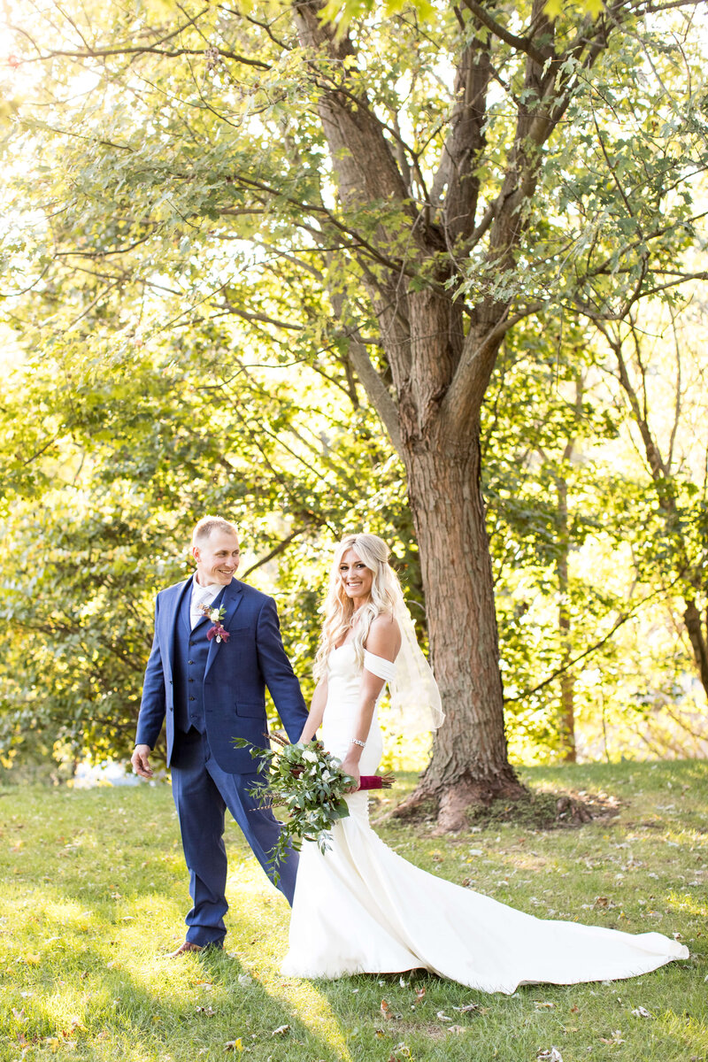
I think many of my clients also think that navy + white offends no one because it’s frequent in photo sessions. This is drab and boring, friends! It’s also very nautical and Deep Creek is a mountain lake. Navy + white doesn’t really fit our aesthetic like the water/oceanic/sea shoreline theme might suggest. We have four seasons…and they come in a multitude of colors. Hues of yellow, green, red, orange, white, blue! Our seasons can also be your color inspiration.
One more thought on why more color is better: In my opinion, it’s less forced and more natural. When does your whole family dress in the exact same one or two colors? Probably never. Unless you’re all bridesmaids and groomsmen in a wedding.
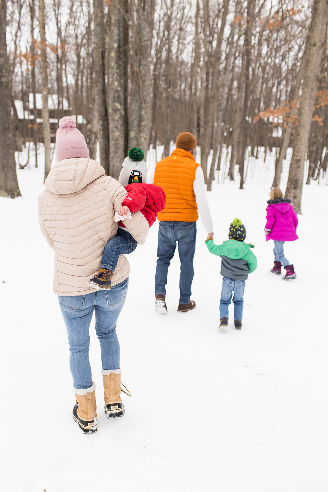
Now for some visuals! Photo examples for anyone looking for outfit inspiration…
First up, POP OF COLOR.
If lots of color isn’t your style, and you should definitely be dressing IN your personal, comfortable style for photo time, maybe try a pop or two…
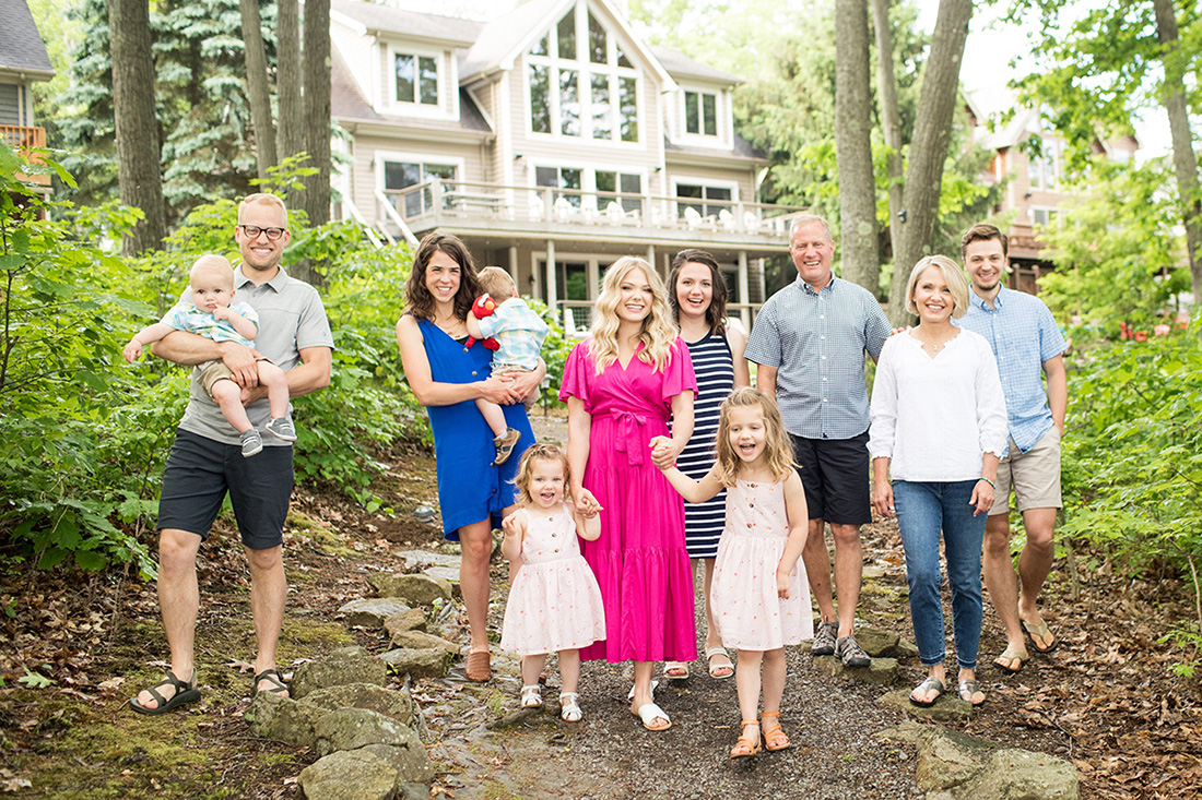
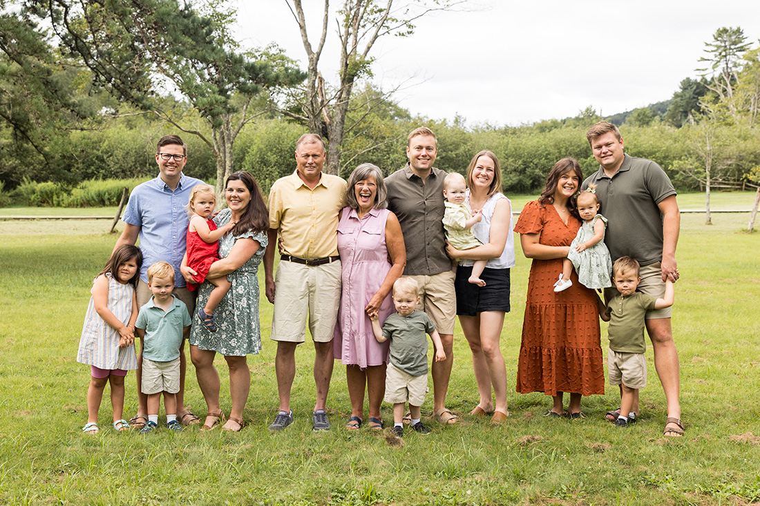
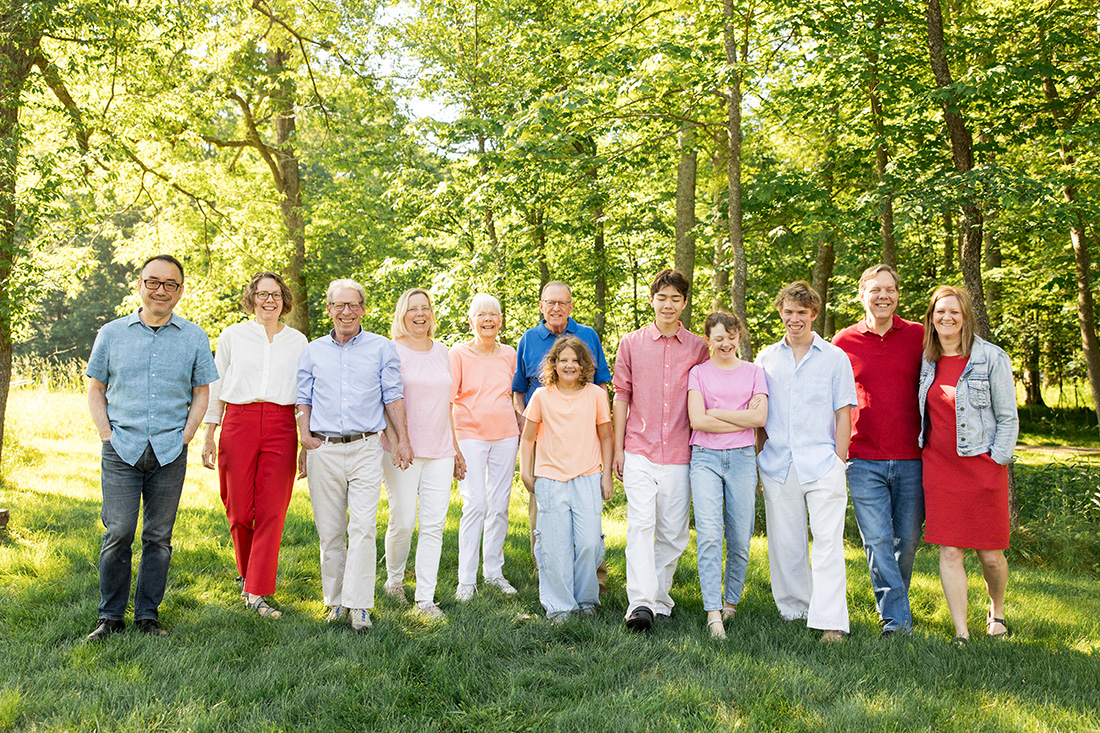
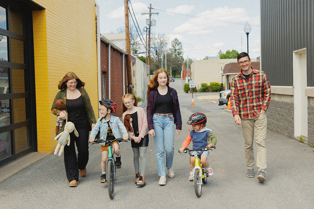
Now for LOTS of color! The JFP Color Guide that I share with clients includes color palettes for coordinated clothing inspiration. Each palette includes five colors (the folks in the photo above actually chose the “summer bold” palette for their inspiration) that can either be taken literally or expanded upon…
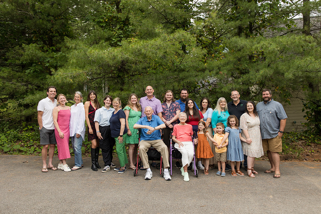
I also support pops of patterns and prints, too!
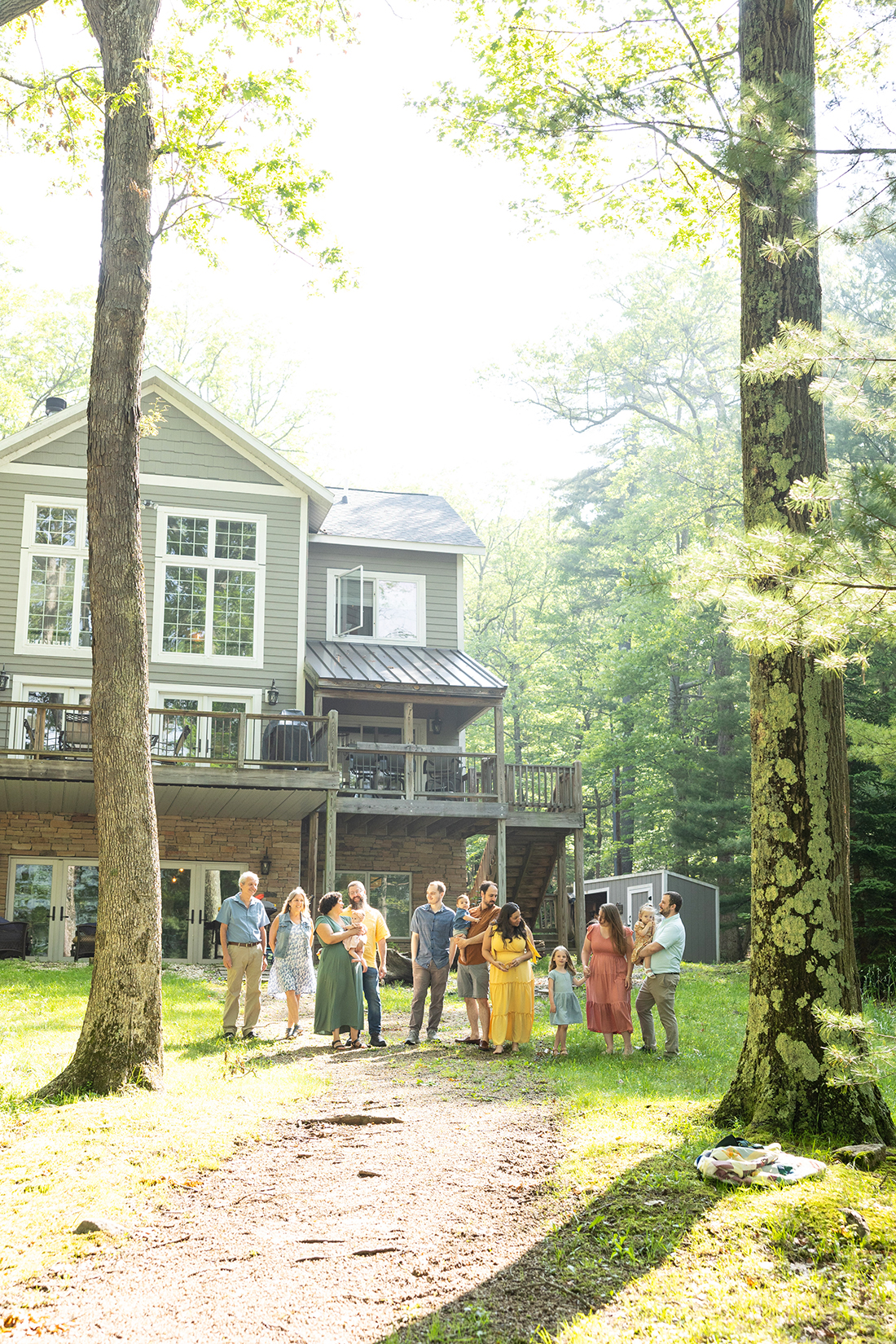
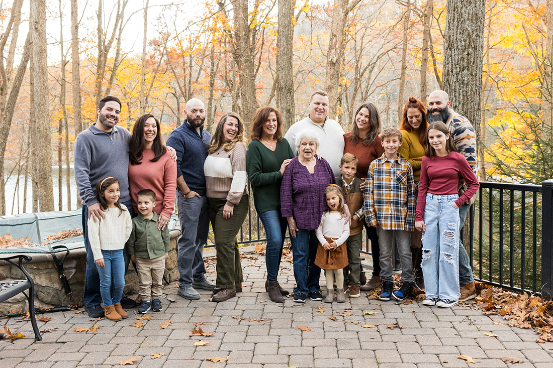
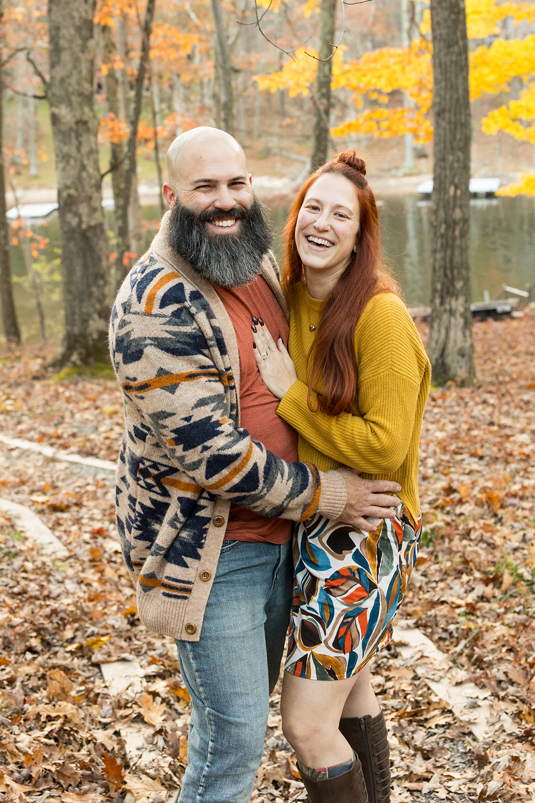
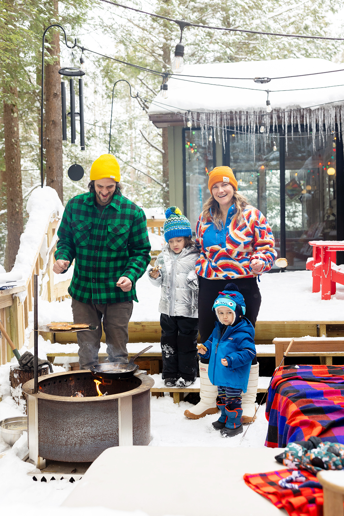
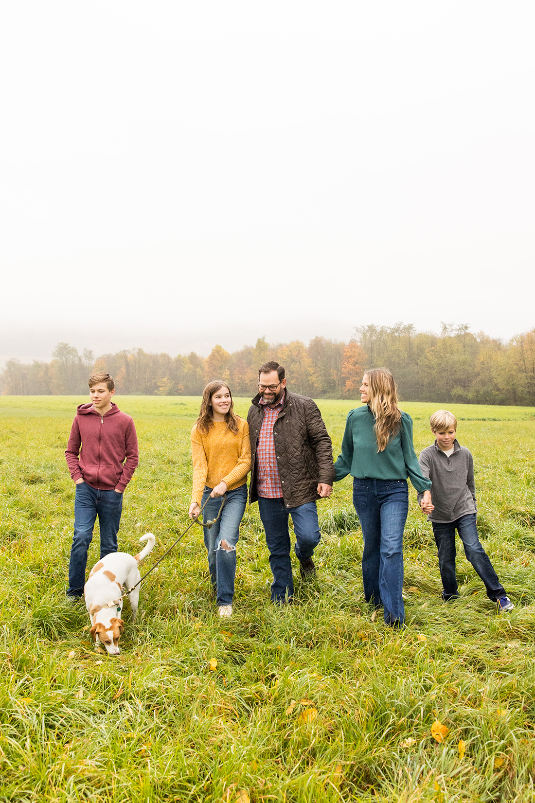
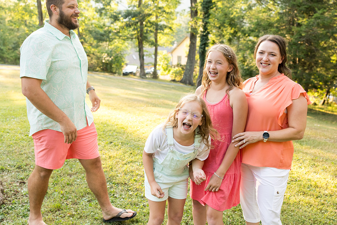
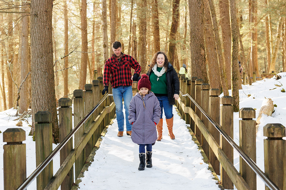
Lots of color can also be subtle…
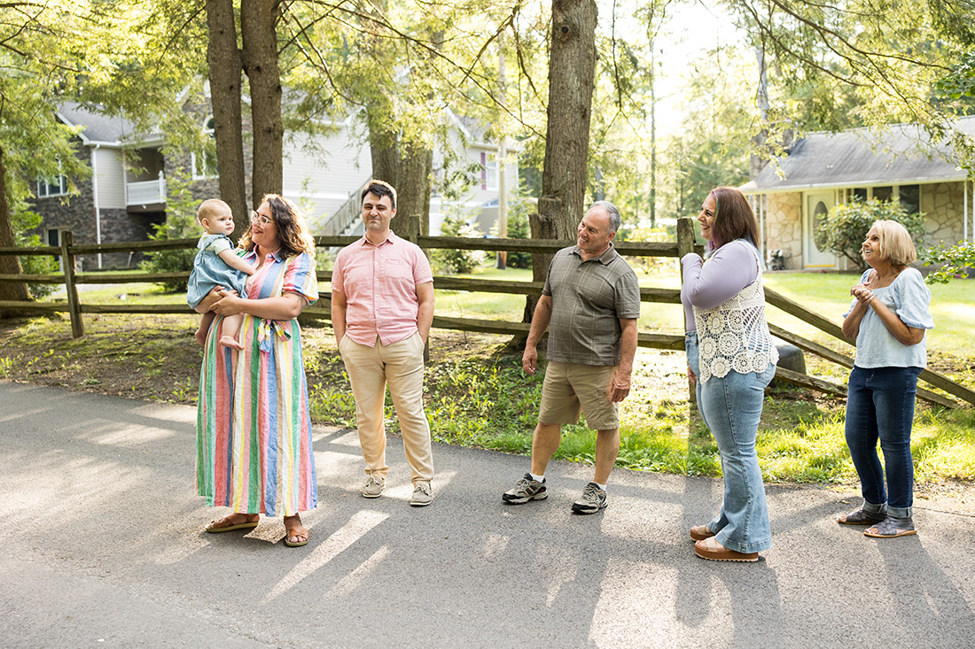
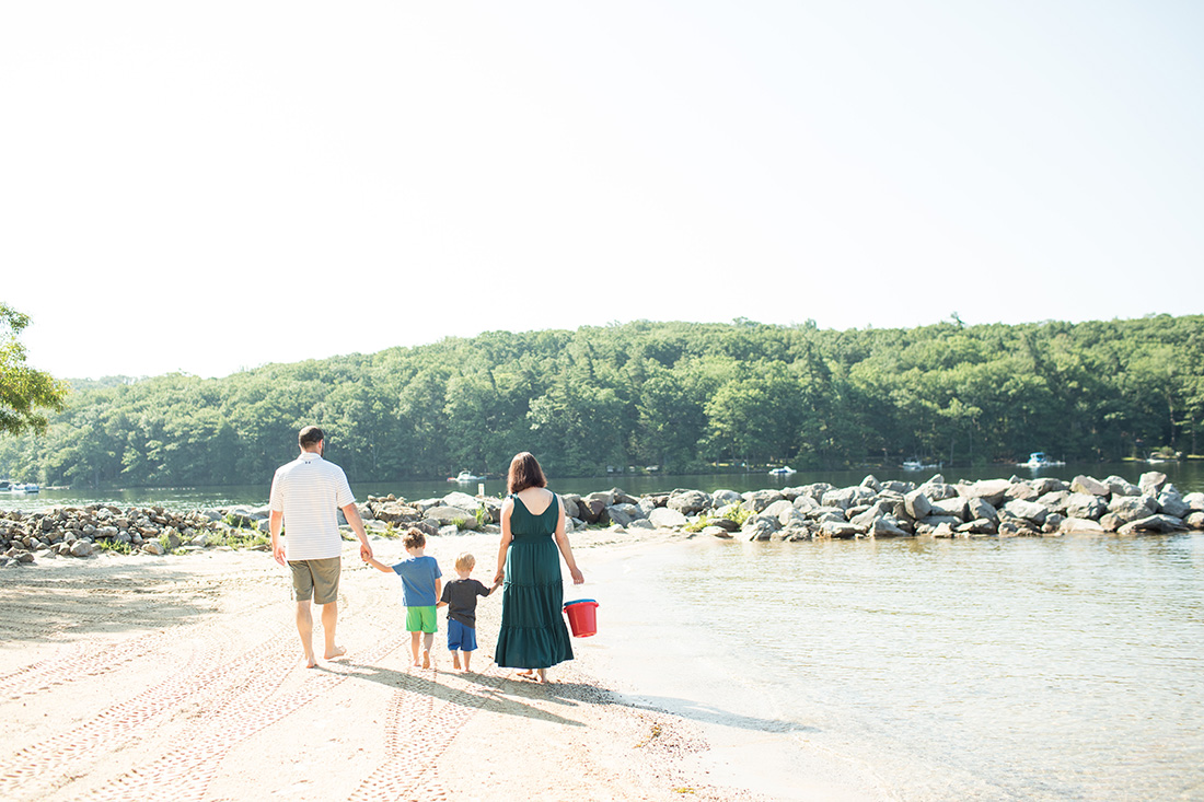
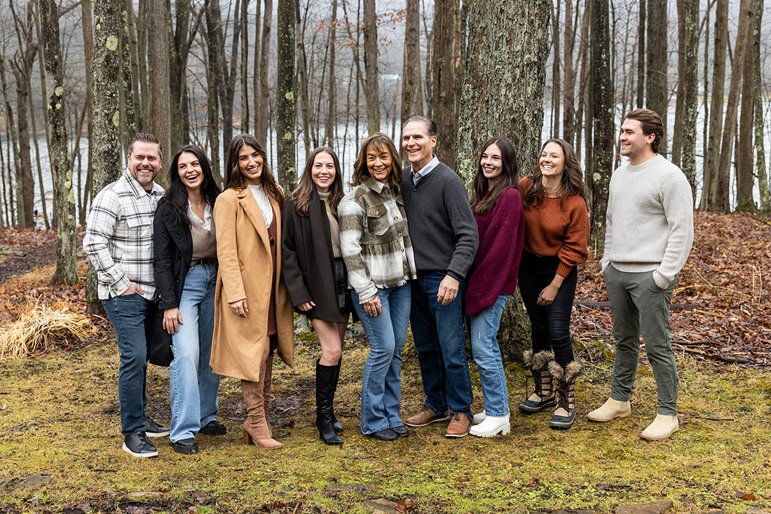
For those asking about blue and white, because this a common occurrence, here are some examples of what that looks like…
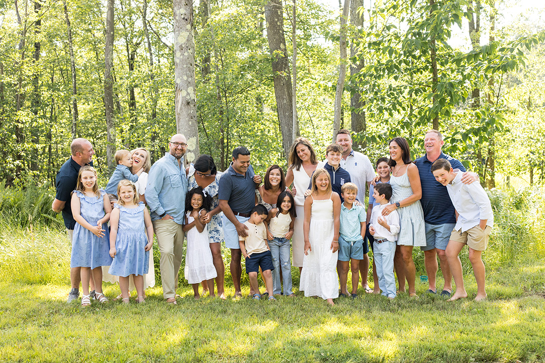
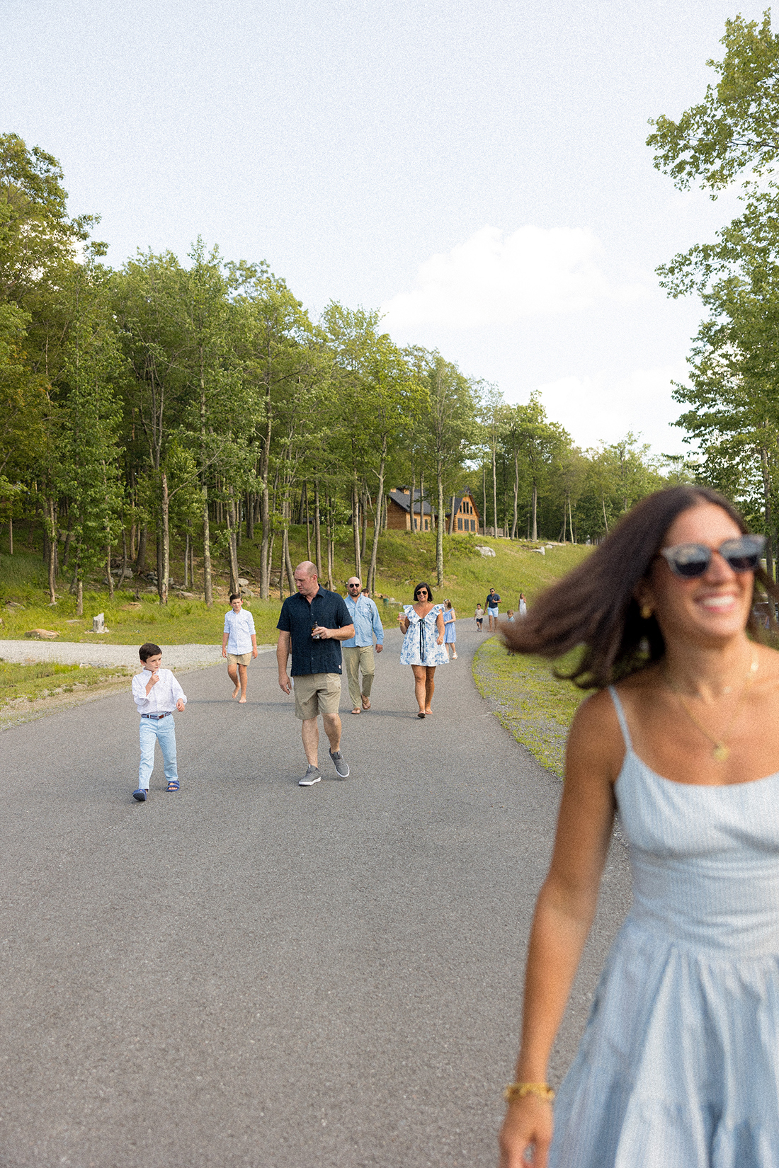
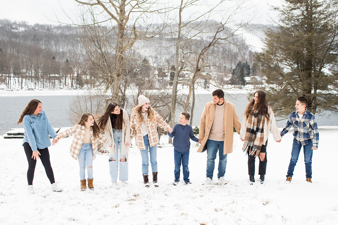
Personally, I love blue and white in winter when there’s snow. The blue + white + tan colors above compliment the season so well! But if considering blue + white in the other three seasons, I highly recommend throwing in at least 2-3 more colors for interest – reds, greens, oranges, purples, and yellows, for example…
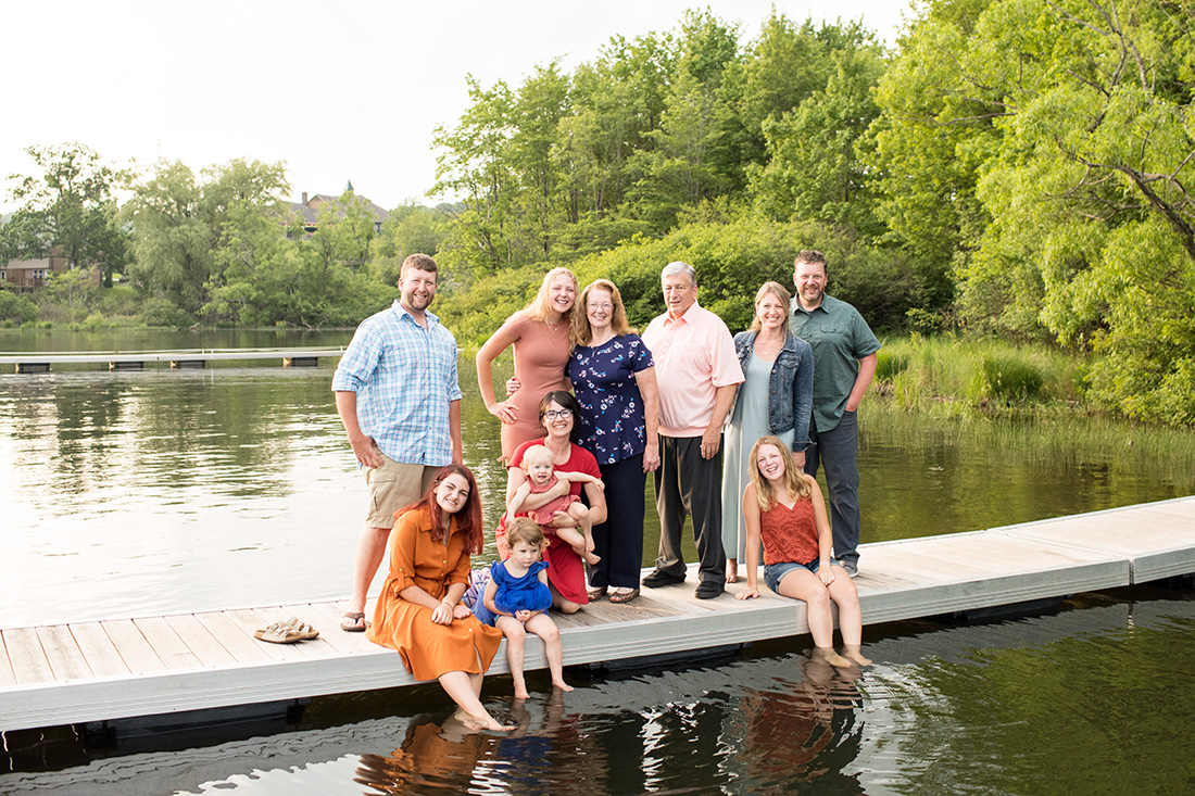
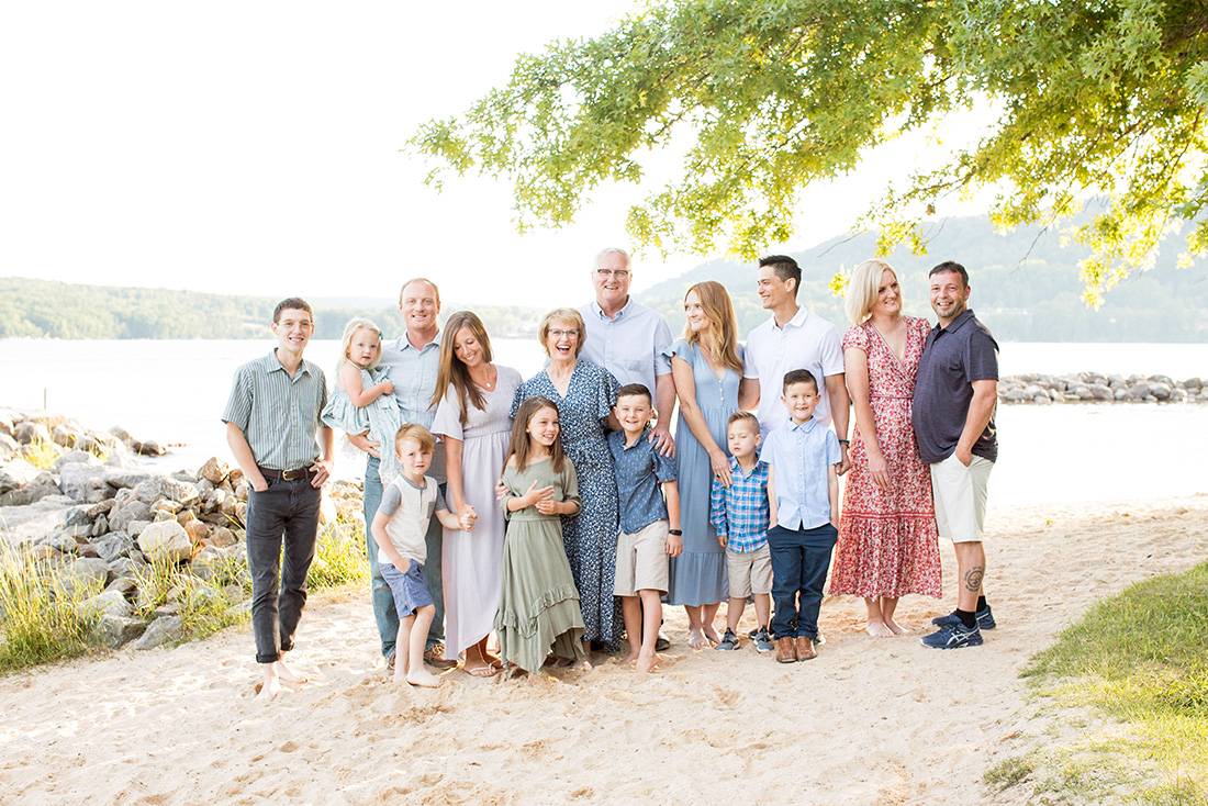
Lastly, neutral. A big lacking of color. I can’t fight you on it if you really want it, and again, if it’s within your personal style, go for it! Here are some examples of what having very little color looks like…
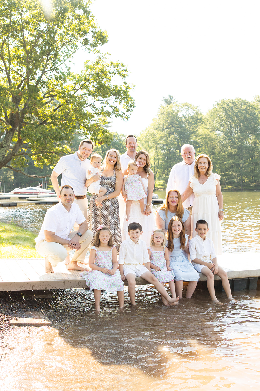
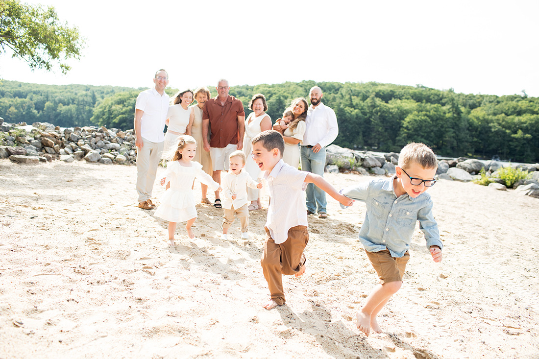
Make note in the picture above: a lacking of color BUT little pops of subtly with the brown-copper shirt for grandpa and tan bottoms on the boys. I like it!
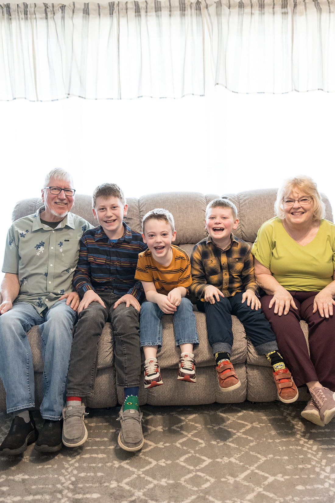
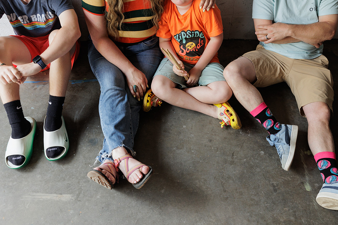
Okay, one more round of examples in a plea for everyone to try going more casual! I’ve found dressy shoes, bib overalls, and white pants to be a few of the uncomfortable, troublesome things kids are sometimes asked to wear during photo time. And the adults in button-down shirts, polo tops and sun dresses? It’s expected, and yes, you look nice and little polished. But are you comfortable? Do you look natural and like yourself? If your answer is no, go more casual and less coordinated…
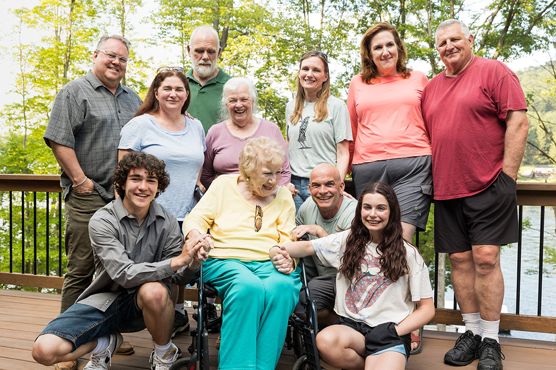
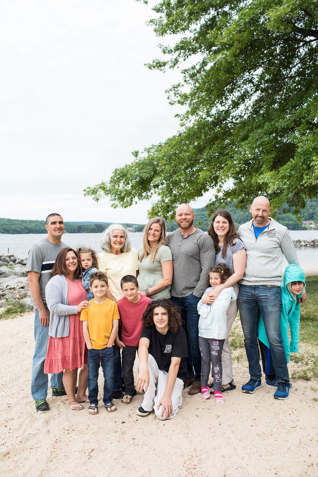
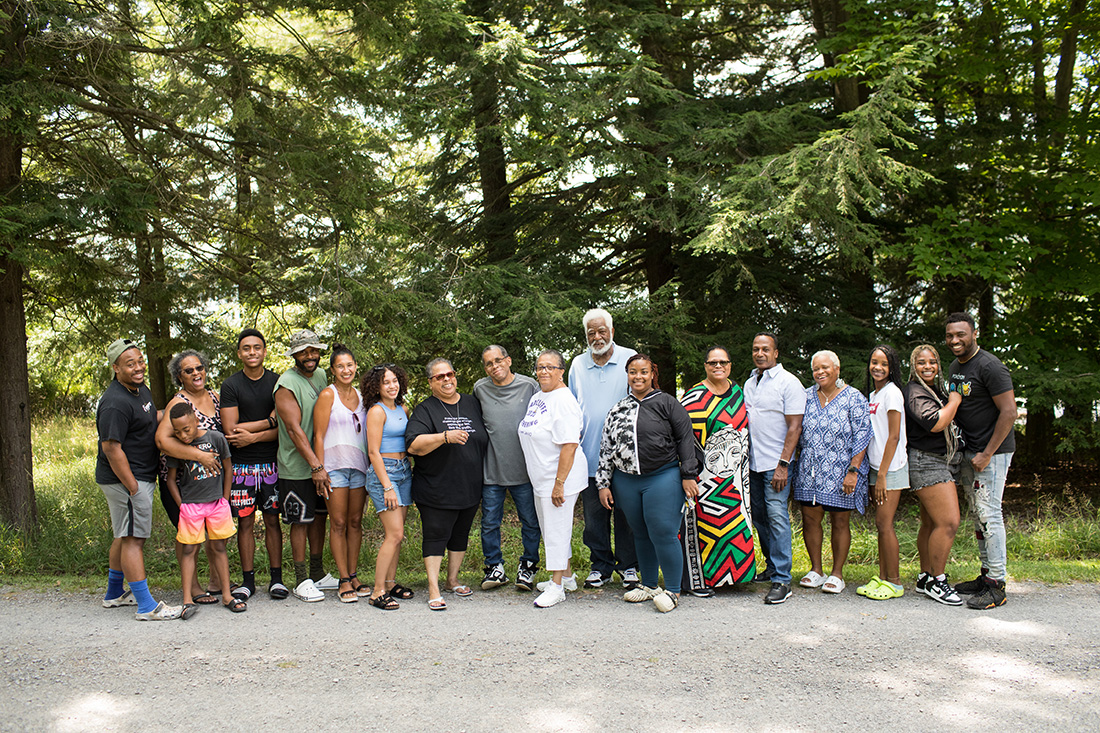
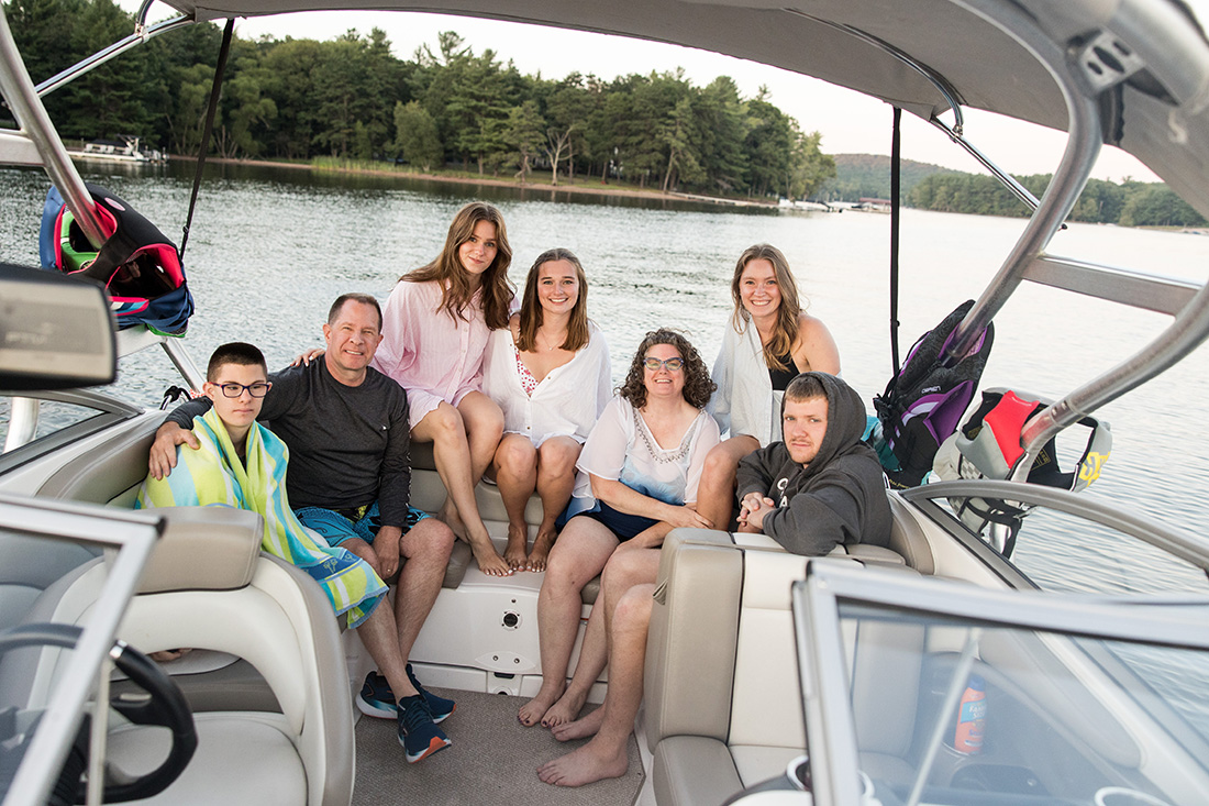

And yes, if your kids want to wear sliders and crocs, and you want your toes hanging out and your husband wants to wear funky socks, do it. Be you. Be comfortable. Don’t force.
More on family photo sessions here!
Related